Equilibri
Brand Identity for Equilibri - A community-owned organic health food cooperative
The Client
Equilibri is a people-owned cooperative organic health food store in Enghien, Belgium, founded in 2023 by local residents determined to bring natural, sustainable food options to their community.
Type
Client project
Client project
Sector
Retail
Discipline
Brand identity design
Retail
Discipline
Brand identity design
The Context
Building on the legacy of Autrement—a beloved local store—the cooperative needed to establish Equilibri as its own distinct entity with a new location and expanded vision. While maintaining the trust of their existing customer base, they aimed to attract new members and position themselves as more than just a store: a community hub for balanced, conscious living.
The Challenge
Create a brand identity that would:
• Reflect the cooperative's core values of community ownership, sustainability, and wellness
• Differentiate Equilibri from Autrement while honoring its roots
• Communicate trustworthiness and quality to health-conscious consumers
• Support their mission to become a fully people-owned cooperative
• Convey the concept of "balance" inherent in their name
The Solution
I developed a complete visual identity system centered on the concept of equilibrium and community:
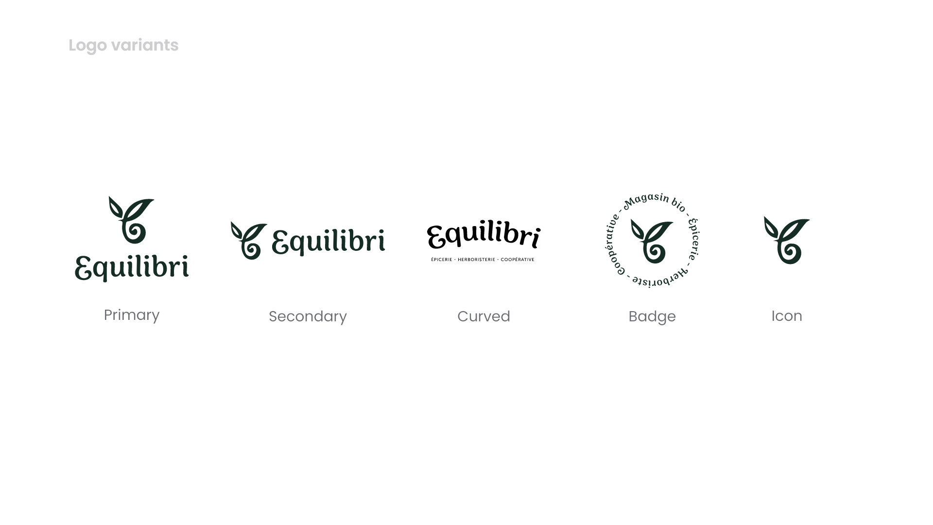
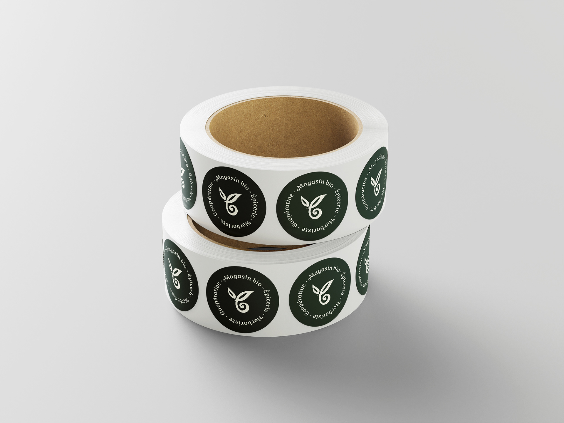
Logo Design
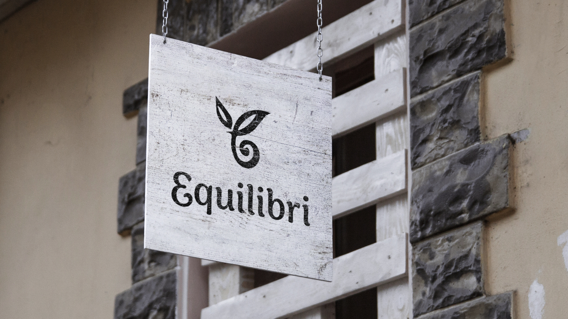
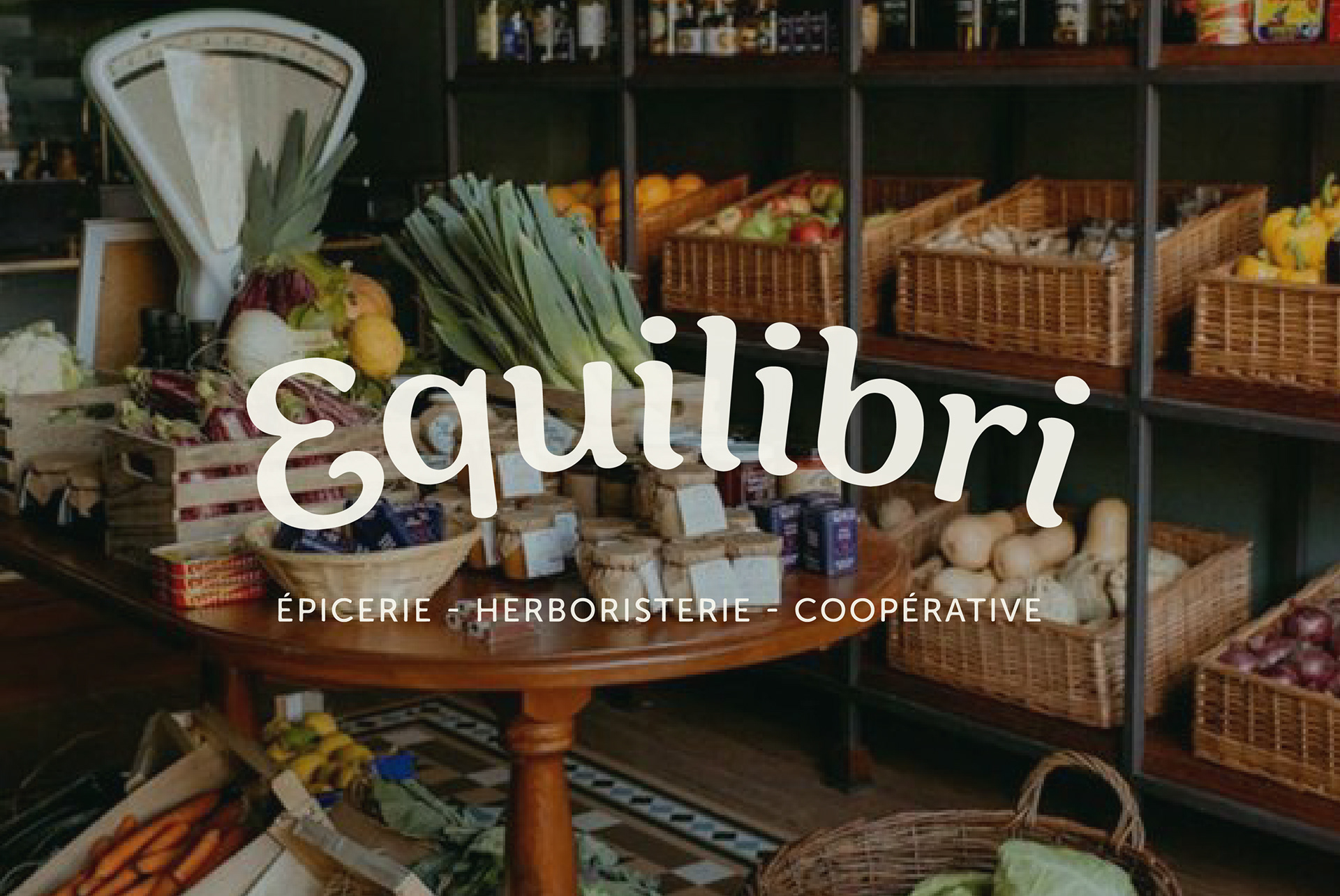
The logo honors Autrement's legacy through subtle visual references that reassure existing customers, while establishing Equilibri's unique identity. Organic serif forms balance professionalism with warmth—appropriate for the health food market while reflecting the cooperative's natural, community-driven values.
I developed a complete logo suite with multiple variations optimized for diverse applications—from product packaging and storefront signage to digital platforms and print materials—ensuring brand consistency and legibility across all touchpoints.
Color Palette
I developed a complete logo suite with multiple variations optimized for diverse applications—from product packaging and storefront signage to digital platforms and print materials—ensuring brand consistency and legibility across all touchpoints.
Color Palette
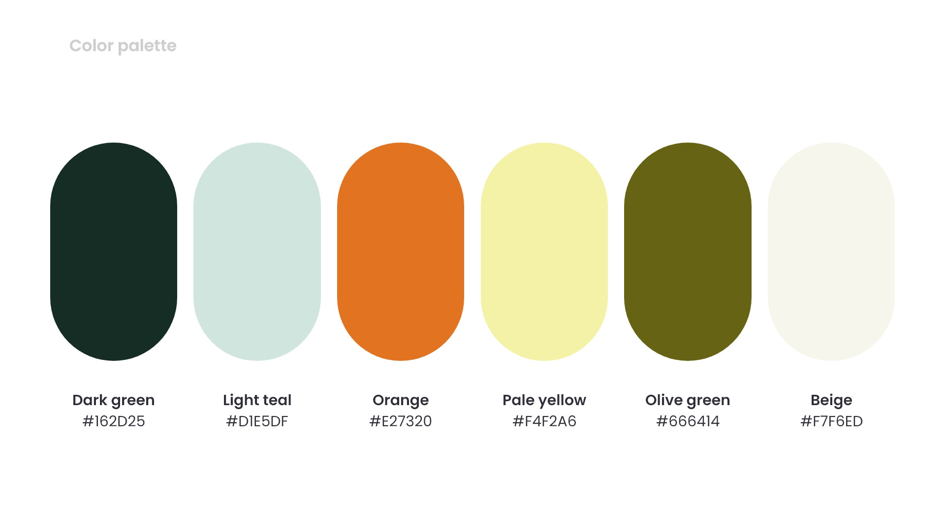
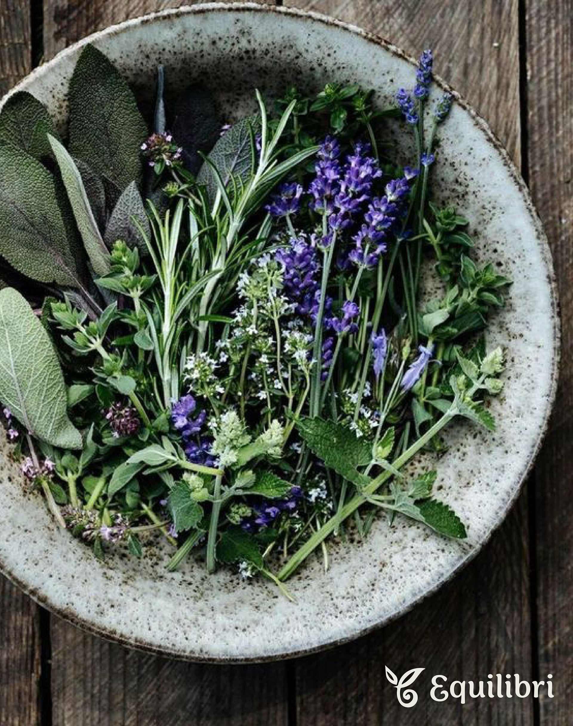
The earthy color palette grounds the brand in nature and wellness, combining deep greens and warm olive tones with vibrant orange and soft yellow accents. Light teal and neutral beige balance the system, creating an approachable, organic aesthetic. The nostalgic, grounded feel reflects both Equilibri's natural product focus and its community-driven values—while remaining appropriate for the health food market.
Typography
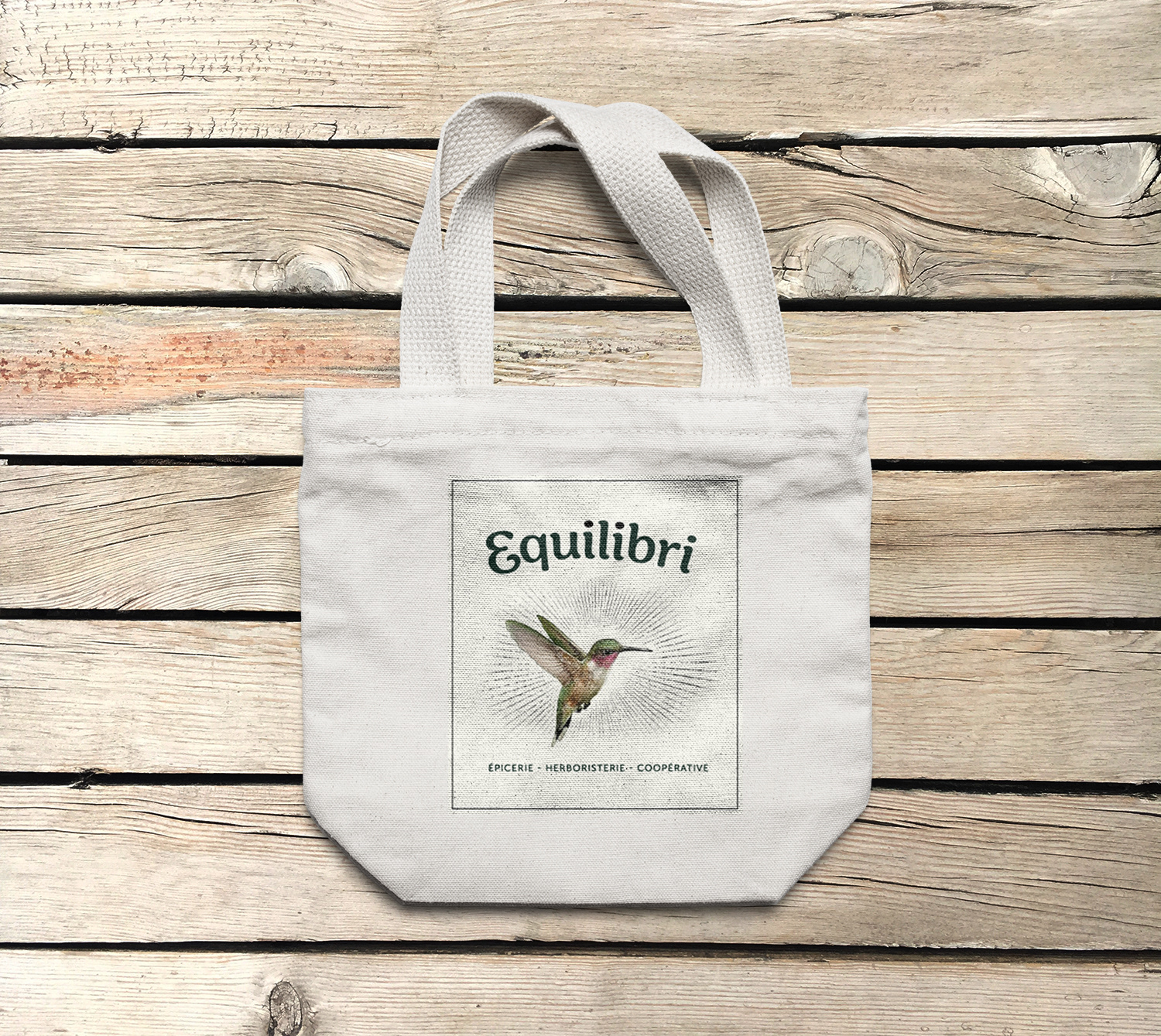
Typography
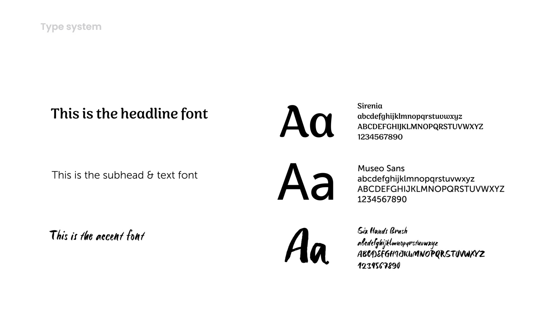
A three-tiered typographic system balances elegance with versatility across all brand touchpoints.
Sirenia, a refined serif, serves as the headline font—its organic, slightly decorative forms echo the logo's elegance while maintaining excellent readability. Museo Sans provides clarity and modernity for body text and subheadings, ensuring legibility across digital platforms and print materials. Six Hands Brush adds a handwritten, human touch for accent elements—reinforcing the cooperative's personal, community-driven character.
Together, the pairing creates a sophisticated yet approachable voice: professional enough for the health food market, warm enough for a neighborhood cooperative, and flexible enough to work seamlessly from product packaging to storefront signage to web applications.
The Impact
The identity helped Equilibri successfully launch their campaign in February 2023 in order to attract new cooperative members.